A complete guide to mastering visual headers and icons in Power BI — Part 2

Visual headers extend the features offered by Power BI and interactivity between visuals and the users. A visual header is the set of icons that pop up when you hover over a visual.
This article discusses the visual header icons in detail, explaining their purpose, applicability, and considerations. We also look at scenarios where you might want to disable a particular icon for the end-users.
In a previous article, we talked about the visual headers, their behavior, and the report level settings. We briefly talked about the icons and their appearance. We recommend going through it if you haven’t already to familiarize yourself with the concept.
Visual Header — Icons
Before we begin, let’s look at the visual header icons. The following image showcases almost all of the icons in the header.

Let’s take a look at the icon summary table again. The table summarizes the available header icon toggles, their icons, and considerations that determine their availability and applicability.

The toggles marked “NA” don’t have an associated icon, and their visibility doesn’t seem to be affecting visual headers in any way. The Power BI community is unclear about the purpose of the Visual warning, Visual error, and the See data layout toggles. The Comment button gives the impression that comments can be disabled at the visual level. In reality, this toggle does not affect the visual header, and comments can only be disabled at the report level. These icons will not be a part of this article; we will discuss other icons in detail.
Visual information icon
The visual information icon can notify the user of a possible problem or an error. The visual information icon shows up in the following cases (this list is just a few examples):
- Map: when values are outside the latitude or longitude valid range or when there’s not enough data to create a filled map.
- Pie chart: when it has negative values in the data.
- Bar, scatter, or waterfall chart: when there are too many data points and all data points can’t be shown on the visual.

Hover over the icon to see the information text or the error message, and click to see the details that can help you fix the issue.

We recommend this icon to stay on as it provides valuable information to users if something goes wrong, especially when the personalization feature is enabled.
Drill icons
Drill icons come in a set of six (five toggles and one complimentary) and require a hierarchy to be present in the visual. Users can drill down when a visual has a hierarchy to reveal additional details. It’s important to point out that all the visuals have the toggles for all the drill icons in their Header icons settings. However, the icons themselves only appear if the visual has a hierarchy.
We will use a matrix visual for our demonstration with a year, quarter, and month hierarchy in the rows and a region and center hierarchy in the columns. The following image showcase the default state of the matrix with drill icons highlighted in yellow.

Drill on dropdown icon: The drill on dropdown is available for the matrix visuals, which have hierarchical data in both rows and columns. For user selection, it provides a dropdown with two options, Rows and Columns. The drill action from the other drill icons (except the drill down) applies to the selected axis of the matrix.

Drill down icon: Drill down is used to turn on the drill on one field at a time by selecting a visual element. By default, selecting a visual element cross-filters (or highlights) the other charts on the report page. The drill down icon changes this behavior and allows the user to drill down on the selected field. The Drill mode icon replaces the drill down icon to indicate this new behavior, i.e., drill mode is on. Clicking on the Drill mode icon turns off the drill down behavior without affecting the drilled state of the visual.
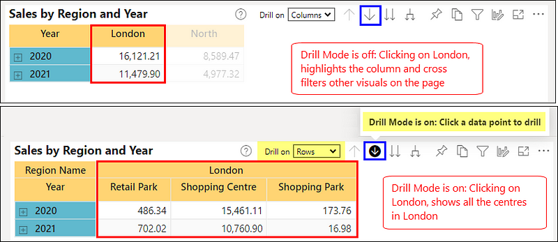
Drill up icon: Drill up brings you one level up in the hierarchy. A greyed-out icon means you’re already at the top of the hierarchy.
Show next level icon: Show next level drills down all fields at once and takes you to the next level in the hierarchy. A greyed-out icon means you’re already at the lowest level of the hierarchy, or all fields can’t be drilled down to the next level at once.

Expand to next level icon: Expand to next level adds an additional hierarchy level to the current view for all the fields. A greyed-out icon means you’re already at the lowest level of the hierarchy, or all visible fields can’t be expanded to the next level at once.

An interesting point to note is that the drill down action works regardless of the selection in the drill on dropdown, i.e., you can drill down both rows or columns by clicking on them. In contrast, the other drill actions work on the option selected in the drill on dropdown.
Pin icon
Pin icon lets users add the visual to a dashboard. They can select an existing dashboard or create a new one. Users can also choose to keep the current theme of the visual or use dashboard’s theme (if any).

We recommend turning this icon off:
- When you do not want your users to create dashboards by mixing visuals from different reports.
- When your reports are not mature enough and are subject to frequent changes, any removed visuals will disappear from users’ dashboards, confusing them.
Focus mode icon
Focus mode lets you expand a visual to see more detail. For example, maybe you have a dashboard or report that is a little crowded, and you want to zoom in on only one visual. This is a perfect use of focus mode. Focus mode allows you to interact with your visuals while removing the clutter from the screen.

Focus mode is not available for certain visuals like cards and Q&A. We recommend turning this icon off when it doesn’t add value for the end-users, e.g., slicers.
Filter icon
The filter icon shows the list of the filters and slicers applied on the visual.

By default, all filters and slicers applied on a visual are visible on the filter icon. However, to prevent filters from showing up on the filter icon, you can hide them on the filter pane using the Hide filter (eye) icon in the filter card (in editing mode or Power BI Desktop). For instance, If you need to hide data cleanup filters that exclude nulls or unexpected values.

Help tooltip icon
The help tooltip (or visual header tooltip) icon provides flexible and interactive support information for a visual. It’s like any other tooltip that you’ve come across in Power BI. The only difference is that it doesn’t need any data points to function.
Help tooltips can be a simple text or a report page tooltip. Help tooltips are generally used for annotations, showing calculation logics, point of contact for a particular visual, providing instructions to users on how to navigate or interpret the visual, or showing additional details related to the visual like data source, last refresh, etc.
Help tooltip icon is disabled by default for all the components. Enabling the toggle adds another pane to the component’s settings pane to set the tooltip type (text or report page) and the visual characteristics of the text. Following image showcases both text and report page tooltip samples.

Copy icon
Copy icon lets you copy the visual as a static image that can be pasted to other applications. Power BI may take a few seconds to prepare your visual image. Follow the instructions on the dialog until your image is ready. The copy feature is not supported for all the visuals, and the icon greys out for such visuals, e.g., Maps, Python and R visuals, etc.
Following metadata details are also supplied along with the static image:
- Link to the Power BI report
- Title of the report
- Notice if the image contains confidential information
- Last updated timestamp
- Text description of the filters applied to the visual

The crucial point is that the Power BI admin can control whether visuals can be copied and who can copy the visuals. The copy icon disappears if the admin has disabled the feature or if the user is not allowed to copy a visual. The copy icon toggle disappears from the Power BI Service for report developers.
Personalize visual icon
The personalization feature helps users gain further insights through ad-hoc exploration of visuals on a Power BI report. Users don’t need edit permission for the report or go back to the report author for a change. Personalize visual icon brings up the personalization pane to modify all sorts of properties of a visual, such as:
- Change the visualization type
- Swap out a measure or dimension
- Add or remove a legend
- Compare two or more measures
- Change aggregations, etc.

Reset this visual icon becomes visible after any changes have been made to the visual. It resets all the changes and sets the visual back to the author’s last saved view. Users can also capture and share their exploration views with others or keep them for later.

Personalization can be controlled at the report, page, and visual levels:
- If personalization is disabled at the report level, then the page level setting, the visual level icon toggle, and the icon from the visual header disappear.
- If personalization is disabled at the page level, then the visual level toggle remains visible, but the icon disappears from the header icons.
We recommend turning the personalization off when allowing users to make changes freely is not desirable or users are not well educated to use this feature to their advantage. Instead, consider using “perspectives” to provide your users with scenario-based, focused, and fine-grained exploration capabilities.
More options icon
More options icon is a collection of multiple actions. But, unfortunately, more options come as an all-or-nothing option. There’s no way to disable the individual actions (except for some). So either keep the icon and all the actions or disable the icon and lose all the actions.

The following table summarizes the available actions, icons, and important considerations.

Add a comment: The comment feature allows users to add a personal statement or start a conversation with colleagues by tagging them in the comments. Commenting features require a Power BI Pro license or the content hosted in the Power BI Premium capacity.
Commenting can’t be disabled for individual visuals. However, the feature can be disabled for the entire report from the report settings, and the action disappears from more options.
Chat in Teams: Chat in Teams allows users to open a Teams chat directly from the Power BI Service. Power BI creates a link to the selected visual and lets users share it with any person, group, or channel on Microsoft Teams.
Power BI admins have control over the chat in teams features, and they can disable it for the tenant or a subset of users. The action disappears from the more options if it’s disabled for the organization or the user.
Export data: The export data enables users to export the data used to create a visual to excel or CSV file. The export data setting is available and applicable at the report level. There’s no option to disable or change the data granularity at the visual level. The following options are available at the report level:
- Summarized data and data with current layout
- Summarized data, data with current layout and underlying data
- None
The following image showcases the export data dialog and options available to the user. The Data with current layout option is only available for table and matrix visuals. The file format varies as per the selected option.
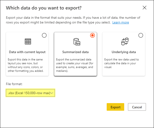
Disabling data export, i.e., option three greys out the export data option for all the visuals in the report. In addition, Power BI admins have control over the file types that can be exported (Excel or CSV), and they can disable it for the whole tenant or a subset of users. The action disappears from the more options if it’s disabled for the organization or the user.
Recommended reading on Export Data in Power BI.
Show as a table: The show as a table lets users see the data used to build the visual in a tabular form. Power BI displays the data below or next to the visual. It can be interpreted as a mix of focus mode and export data with the current layout. This action is not available for specific visuals like cards, Q&A, Key influencers, etc.

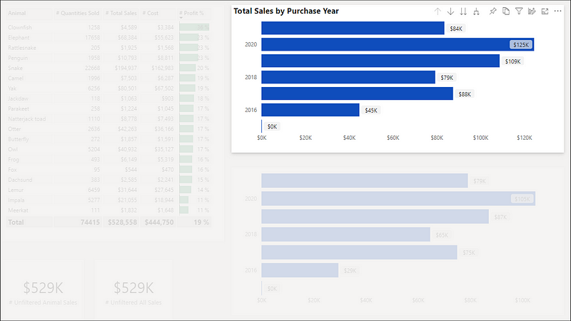
Spotlight: The spotlight action draws attention to a specific visual on a report page. The spotlight highlights the selected visual, and all other visuals on the page fade to near transparency.
The spotlight feature’s significant and handy property is that the bookmarks can retain the spotlight mode for visuals. This property can be utilized in innovative ways to narrate a story or design custom components, for instance, a pop-up.
Get insights: The get insights feature helps users easily explore and find insights such as anomalies and trends in the data. Get insights is supported for reports in Premium and Premium Per User (PPU) workspaces. Users with a PPU license can also use the feature in non-premium workspaces.
Sort by and Sort order: The sort actions allow users to change how the visual looks by sorting it by different data fields. Users can alter the data field to sort by and the order between ascending and descending.
The sort options are dynamic and vary depending on the visual type, data type, and data hierarchy. For example, some visuals also allow sorting the axis and legend separately. Whereas some visuals can’t be sorted, for example, treemap, map, scatter, gauge, card, and waterfall.

That’s all about the header icons. Let us know if you can figure out the ghost icons and their purpose. 😉
 bits2BI
Leave a comment